A couple of weeks ago I redesigned and migrated my San Francisco Tips website to WordPress MU. I used the Thesis theme with some special, but easy to do customizations. And although not all the pages are migrated from the static html design it was formally running on, I managed to migrate almost all content within a day.
I made one critical mistake in my attempts to build a top website: designing for your visitors screen resolution! The way your visitors see your website on their screens is essential for the joy they will get out of their visit. I overlooked one major important point in web design and usability!
Luckily A twitter message brought me back to earth, where screen resolutions are not prepared for a website of 1380 pixels wide!!! Thank you for your advice Cynthia.
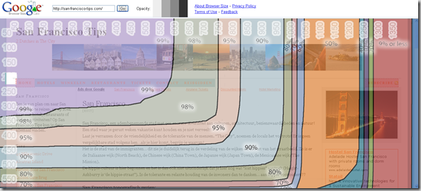
The link shows that the majority of average internet users would not see the better half of my site:
Using the new browser size tool from Google, hosted in Google Labs, you can see the horrible user experience I provide to my visitors in the new design of my site. In my width settings of 1380 pixels, only 9% of average internet users would see the full width of the site! Argh,… I feel a big FAIL sign appearing on my forehead.
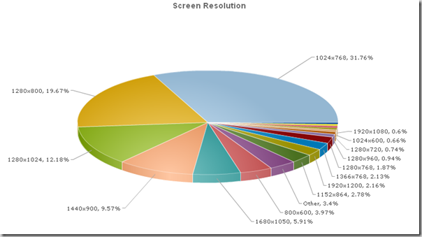
And although the resolution of the average visitor to my site for the last three months is slightly different than the average of the above graph, I took the advise to redesign the site for better fit to the average screen resolution used on the web. Here is the breakdown of the screen resolution for the visitors to my site for the last three months:
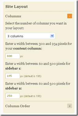
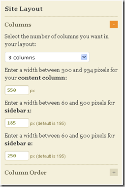
A real big advantage of using the Thesis theme for your wordpress sites, is that you have complete flexibility over the design at your fingertips! Through the design options in Thesis, I can adjust the width of the three individual columns with a couple of mouse clicks.
Changing the main content column from 800 to just 550, will only give me a limited space to upload pictures and/or maps. But as I really want to have the site to have 3 columns, with the right one showing a multimedia box of at least 250 pixels, I really need to trim this middle column down in width.
This is what my website looked like at 1380 pixels wide:
After the adjustments in width, the site looked like this, where the width is a reasonable 1076 pixels.
So the lesson learned for me: Always test your new site or redesigns on different browser resolutions! Just remember how your users will look at your site and make up their mind if they will come back, or not!
Now I only need to skim down the width of this blog to an acceptable width!
PS> Cynthia Laluna is “the marketing maven, Thesis designer, website wrangler, writer, gearhead, tech support mama and general femmegeek” (source: Rowboat Media Website). You can get your custom thesis installation and design through Rowboat Media


Leave a Reply